Guided interaction
- New
- Explanation
- 5-min read
Guided interaction helps users become comfortable and confident with new products, apps, or features through natural, in-context learning. Done well, guided interaction drives engagement, adoption, and retention: users can get started on their own and experience your app's value sooner, so they keep coming back.
The sweet spot lies between two extremes:
- Passive instruction: Out-of-context content users must consult before they can start, such as documentation, courses, or videos, most of which they'll need to revisit later.
- Unsupported immersion: No guidance at all, which can lead to confusion, unanswered questions, and drop-off.


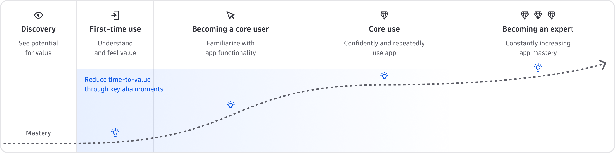
Image adapted from Higgins, 2023.
Phases and user types
Guided interaction isn't only for first-time users; it matters at every phase, as everyone moves at a different speed. Some users may become power users within a week, while others may still be learning for months and peak at the level of core user.
A user's journey moves through five phases:
- Discovery: Users see the potential value of your app.
- First-time use: They open the app and start to understand its value. "A-ha" moments cluster here. Helping users move forward smoothly is the most effective way to reduce time-to-value.
- Becoming a core user: Users become familiar with the functionality.
- Core use: They use the app confidently, repeatedly, and independently.
- Becoming an expert: They keep increasing their mastery. Some become ambassadors, who know the app almost as well as you do and promote it.
Users also differ in confidence, independently of where they are in that journey:
- Curious users want to figure things out for themselves. Give them intuitive design, persistent help, and links to documentation, so they can explore and recover from mistakes.
- Cautious users want to be shown the way until they're confident. Give them the same experience, plus guides they can start themselves and revisit at their own pace.
Principles
The following three principles apply regardless of which component or pattern you use.
Build on intuitive design
Good design is the foundation: it makes it easy for every user to get started, and guidance should be part of every phase.
- Do follow common design patterns rather than introducing new ones.
- Don't treat guided interaction (or onboarding) as separate from your core user journeys.
Place content in context
Users are more likely to read and remember information they meet in a natural, authentic way.
- Do anchor new information to user actions and goals, at the right time and place.
- Don't front-load onboarding, overwhelm users upfront, or force them to switch context.
Let users choose their own path
The journey to confident use isn't linear or time-based.
- Do let users set the pace, skipping or dismissing guidance they can return to later.
- Don't force users into a predetermined journey.
Use the right component or pattern
Before anything else, check that your app has an app help menu. It's mandatory for every Dynatrace app, and it's where users look for app-level help: onboarding, documentation, release notes, keyboard shortcuts, and a way to give feedback. See HelpMenu.
| Component or pattern | Purpose | When to use | When not to use |
|---|---|---|---|
| Microguide | Onboarding | Walk users through an app or feature in a few steps | Basic functionality, or to fix a confusing UI |
| Dismissible card | Onboarding | Announce something that isn't visible in the UI | Critical information, or anything users must revisit |
| FeatureHighlight | Onboarding | Draw attention to one specific feature | Product tours, or anything users must revisit |
| Tooltip | Inline help | Name actions, explain something briefly, or show truncated text | Longer text, links, or critical information |
| InformationOverlay | Inline help | Explain an element whose purpose isn't obvious | Temporary error states, or required input |
| TerminologyOverlay | Inline help | Define a technical term inline | Terms most users know, or anything but a definition |
| ExpandableText | Inline help | Offer more detail where space is tight | Content users need to understand or decide |
| Placeholders and hints | Inline help | Show the expected format for an input field | As a replacement for a label |
| ExternalLink | Inline help | Send users to a resource outside the platform | Critical information, or mid-flow |
| KeyboardShortcut | Inline help | Show the keys for an often-repeated action | Uncommon actions, or mobile and touch views |
Gather feedback
Guided interaction is only as good as the evidence that it works. Tracking engagement and adoption metrics shows where users drop off and which journeys or features to improve, often revealing gaps in onboarding and inline help that nobody reports.
In addition to tracking engagement and adoption, you can encourage users to share explicit feedback in two ways:
- The Share feedback item in the HelpMenu.
- A thumbs up or down next to a specific feature or piece of content, with an optional free-text field for what did or didn't work.