Tooltip
Use the Tooltip component to display extra information when users hover on a
trigger element.
When to use
- To show brief, contextual information about an element, icon, interaction, or feature on hover, without cluttering the interface.
- To reassure users about the purpose of icon-only triggers.
When not to use
- To explain complex terms, use TerminologyOverlay.
- To share keyboard shortcuts, use KeyboardShortcutTooltip.
- For detailed information use InformationOverlay.
- If you need to include a link, use InformationOverlay.
- If the information is critical for the user to complete their task, put it directly in the UI.
Placement
- The default placement is always at the top. If you're working with a vertical list of items, where each item has a tooltip, place the tooltips on the right or left.
- Avoid placing tooltips at the bottom.
Content guidelines


- Trigger (required)
- Details (required)
General guidelines
- Use sentence case (capitalize only the first word and any proper nouns, such as brand names).
- Use plain English and avoid technical jargon, unless it's industry standard.
- Only add details that aren't in the trigger text. For example, if the trigger says “Share”, don't repeat "Share" in the tooltip.
- Don't add headers or buttons.
- Don't add links. If you want to add a link, use InformationOverlay.
- Don't use any formatting, such as bold or italics.
- Don't use quotation marks.
Types of tooltip
Below are three different types of tooltip, including do and don't examples.
Display action or item name
Use a tooltip to show the name and purpose of an icon-only button.
- Keep names simple and consistent with those of other apps.
- Don't add periods or exclamation marks.


Explain something briefly
Use a tooltip to provide a short explanation of something that isn't self-explanatory or commonly understood.
- Only use a tooltip for extra information that isn't crucial for the user to complete their task.
- Keep to one sentence or a maximum of two short sentences.
- One sentence: Don't put a period at the end.
- Two sentences: Put periods after both sentences.




Display truncated text
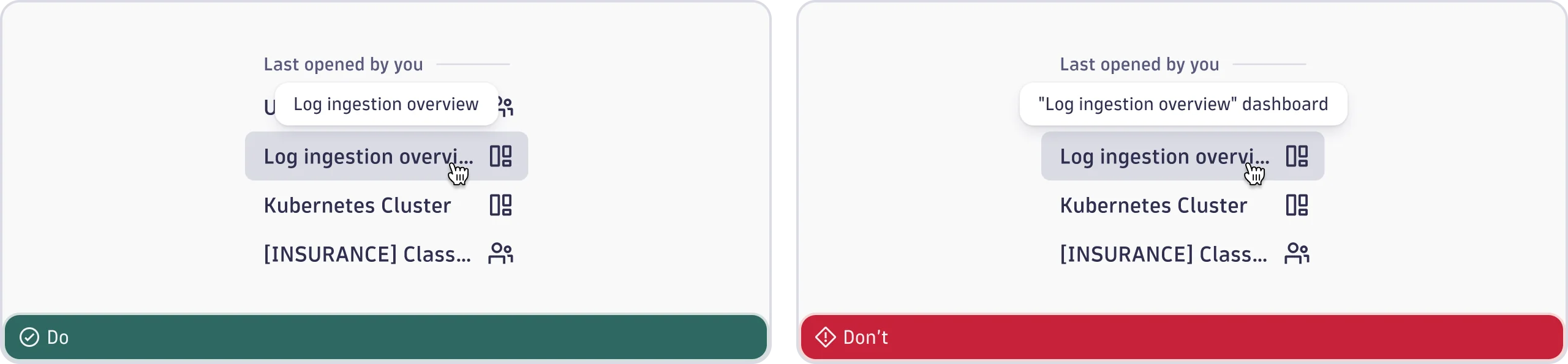
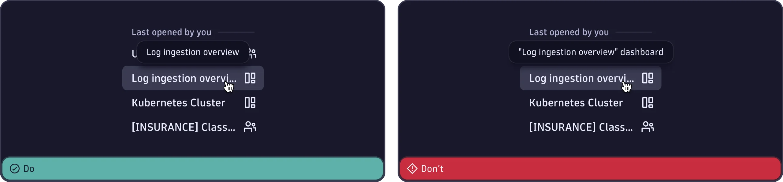
Use a tooltip to show the full text of something that truncates in the UI, for example a document name. Only do this if there's no other way to display the full text, such as line wrapping.
- Show the complete text as it would appear without truncation.
- Don't change the wording or add extra information.
- Don't add quotation marks, periods, or formatting.