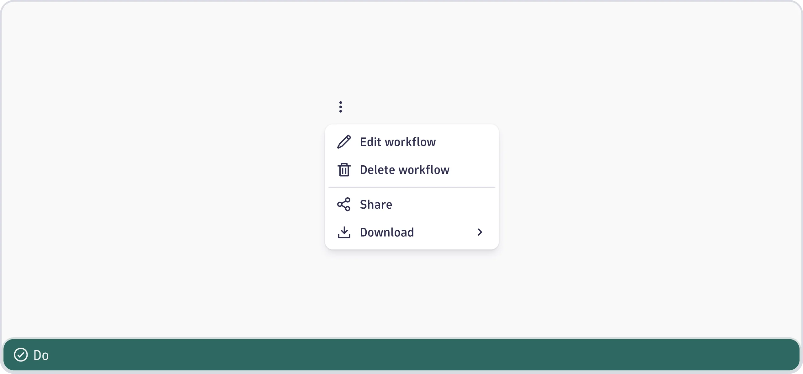
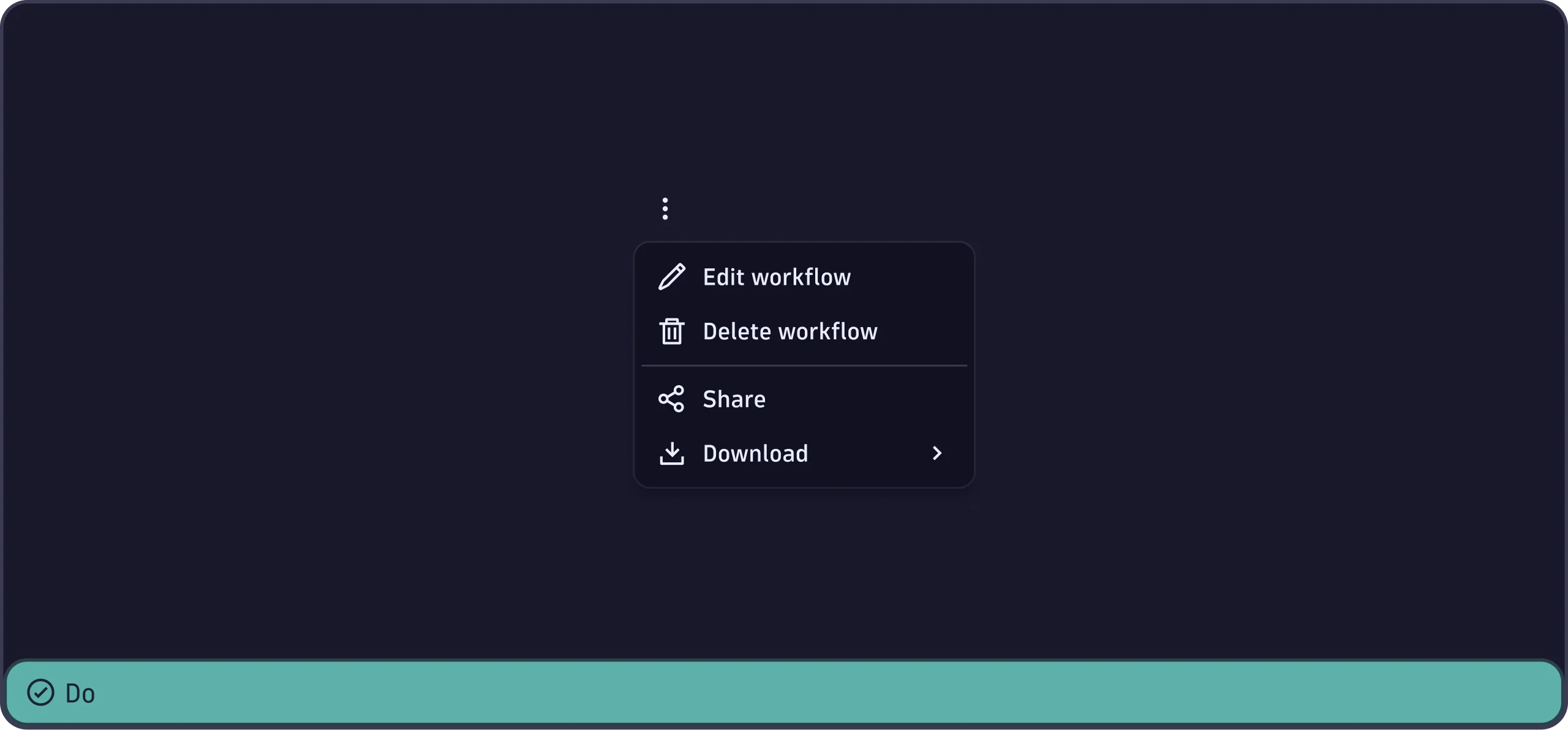
Menu
The Menu component displays the list of action items that are revealed when
the user clicks on the trigger element.
When to use
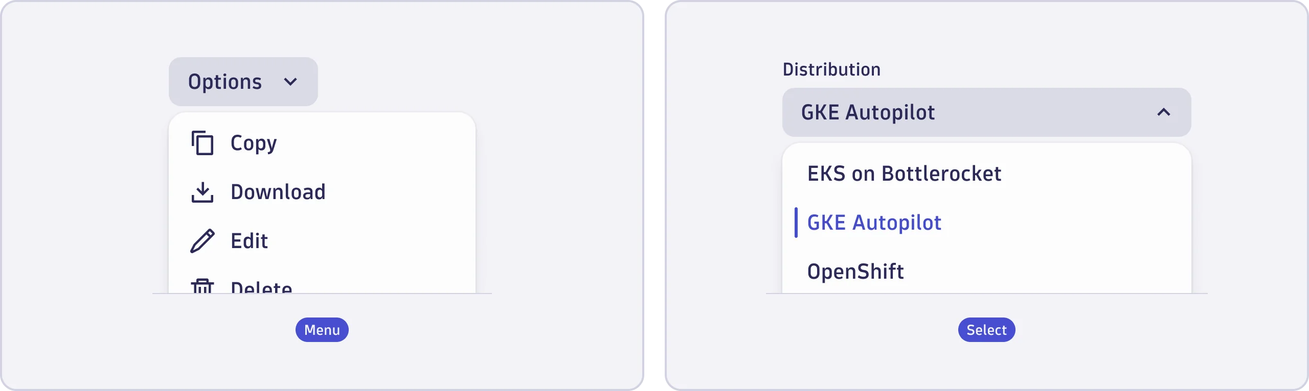
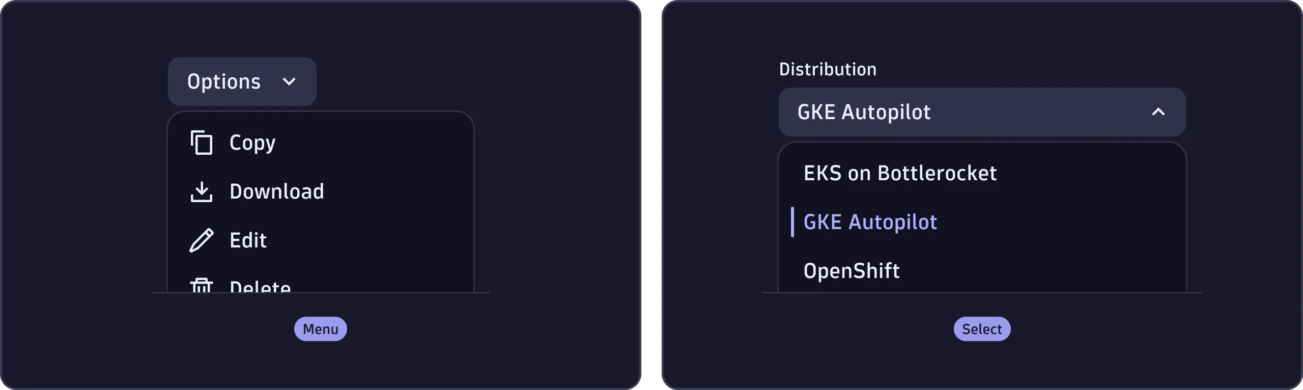
- To group related actions or navigation items in an overlay. These actions trigger immediate events, such as copying, editing, or deleting a table item, via an options button.
When not to use
- To choose one or more options from a predefined list of related items that don't trigger immediate events. For example, selecting a timezone in a form. Use Select instead.
- For disclosure patterns, such as revealing a panel of links or text. Use Accordion or ExpandableText instead.
Content guidelines
- Trigger button (required)
- Options (required)
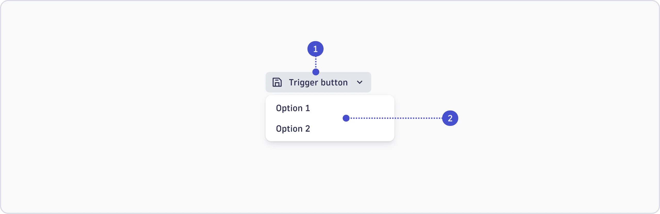

Trigger button
The trigger button may include short, clear labels, and prefix and suffix icons. One or more of these elements may be used. The options can also be opened from a dot menu or the app help menu. See the Accessibility tab for guidance on labeling trigger buttons properly for screen readers.
Options
Labels
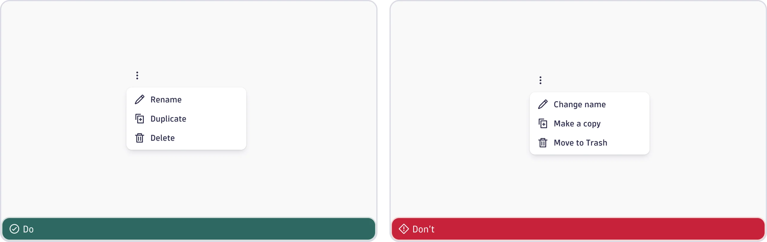
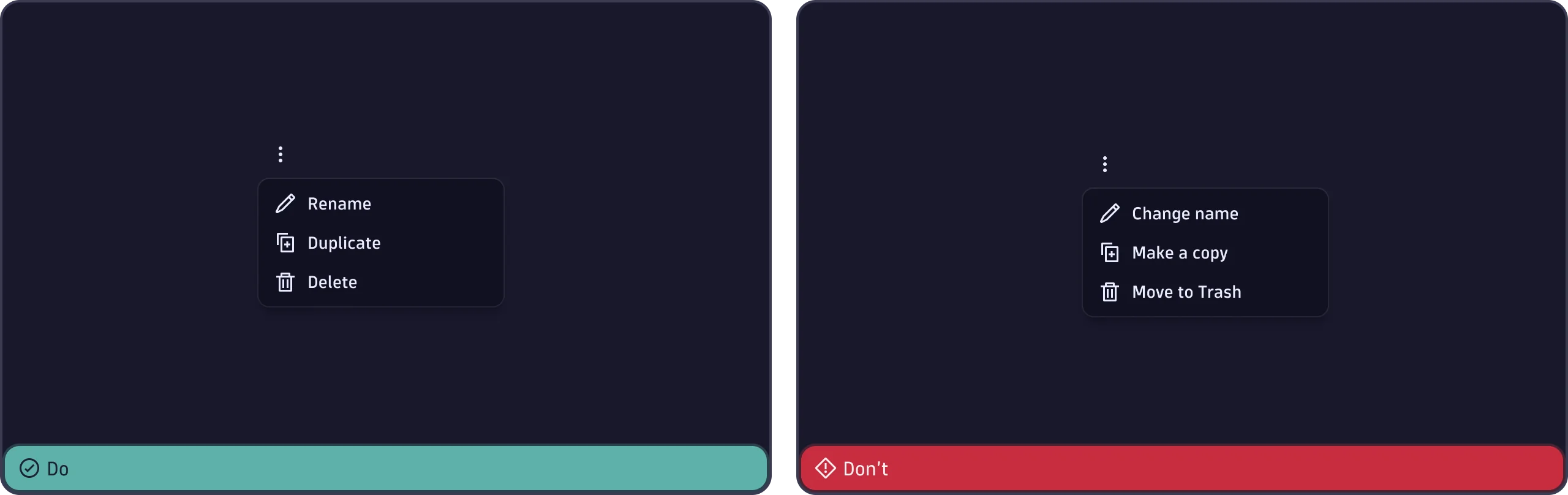
For actions, start with a verb. For consistency and easy reading, use the same grammatical pattern for all items in a group.
- Use sentence case (capitalize only the first word and any proper nouns, such as brand names).
- Keep it short, just one to three words.
- Remove unnecessary words such as "the", "a", or "an".
- Don't add trademarks or registered symbols.
- Don't add periods or ellipses. If the action opens a new view or navigates
elsewhere, use an
IntentButton. If it opens a nested or multi-level menu, use a chevron. - Only use a
Tooltipfor additional context.
Icons
Prefix
- Use the appropriate functional icon.
- Use an app icon only if the action redirects to another app.
Suffix
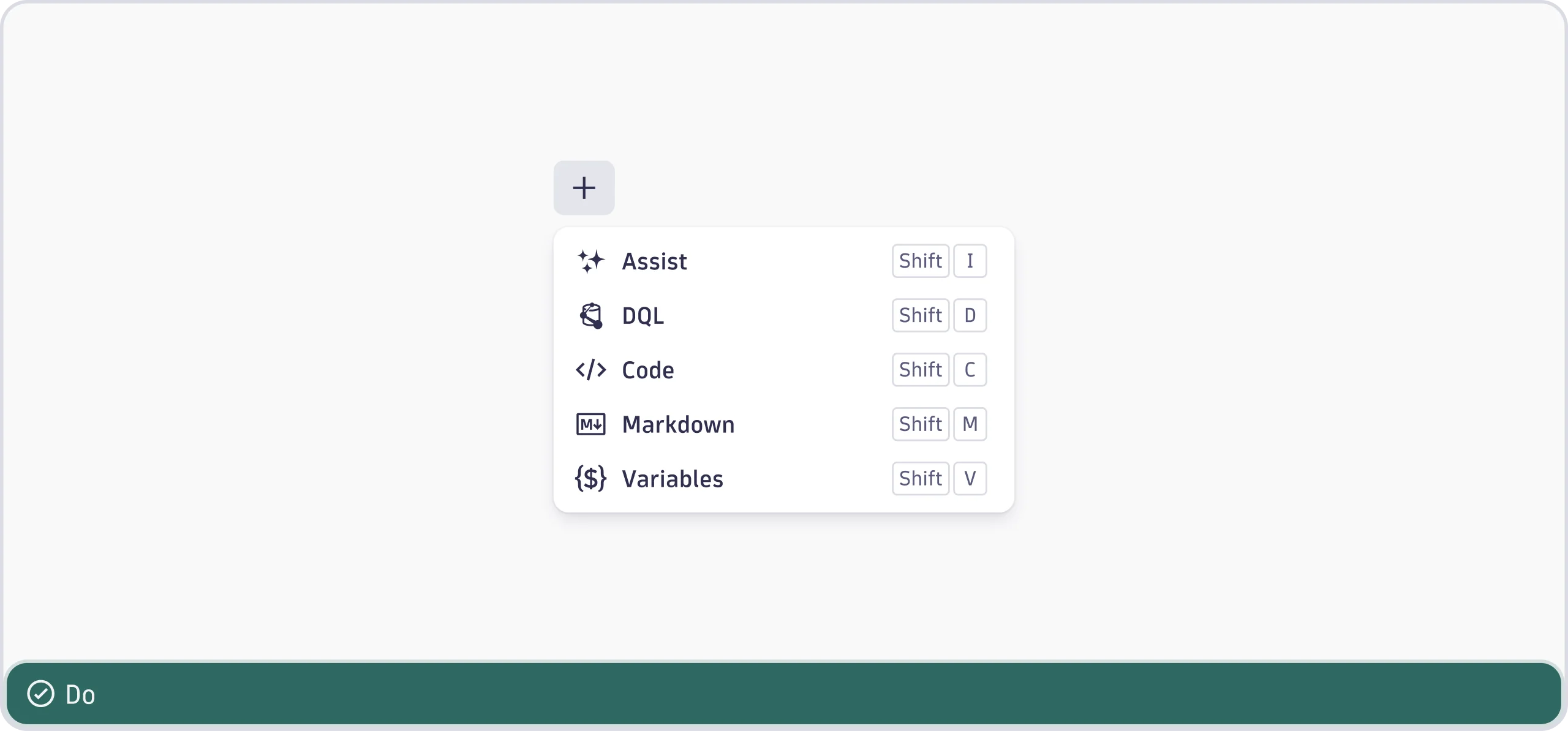
- Include keyboard shortcuts with the
KeyboardShortcutcomponent when relevant.
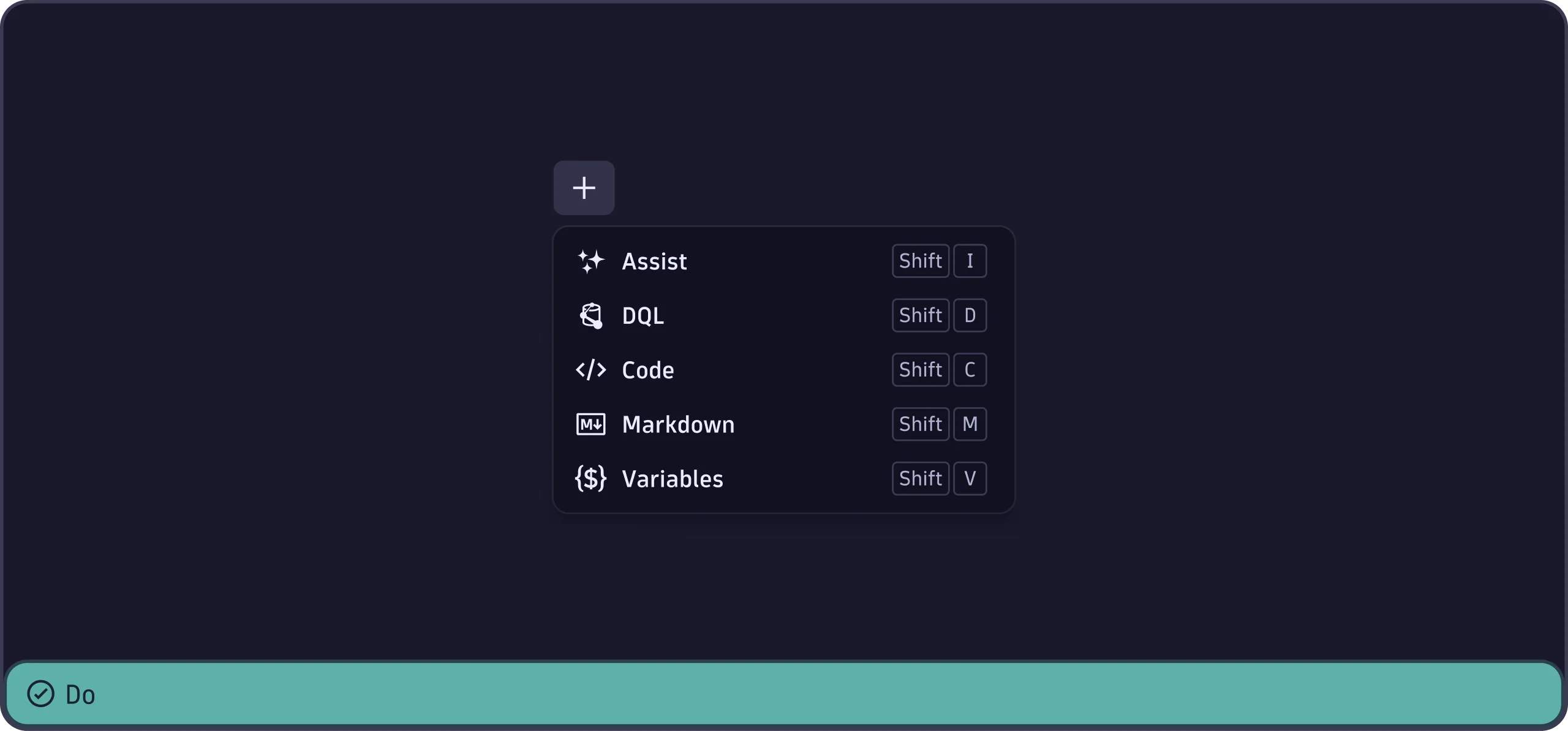
-
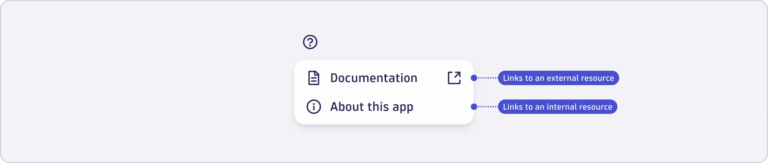
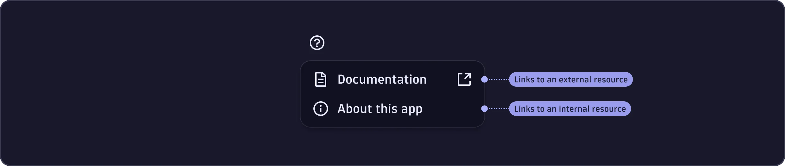
Use the
ExternalLinkicon when the item links to an external resource. External resources are anything outside of the user's current environment, including: -
Other Dynatrace environments (from ENV-ID.dynatrace.com to ENV-ID-2.dynatrace.com).
-
Dynatrace documentation or domains (from ENV-ID.dynatrace.com to docs.dynatrace.com).
-
Third-party domains (from ENV-ID.dynatrace.com to anothercompany.com).
MenuGroup
When a menu contains a mix of actions, functions, and links:
- Group similar items together.
- Separate groups with divider lines.
- Consider adding section labels for context. See Groups and icons for more details.