Surface
Use the Surface component to structure and visually separate content on a page, or to create floating overlays such as menus, selects, and modals.
When to use
- To structure and visually separate content on a page.
- To overlay other content with floating elements such as
Menuoverlays,Selectoverlays, orModaldialogs. - For dismissable cards used in guided interaction.
When not to use
- When you need semantic color emphasis for grouped content. Use Container instead.
Elevations
Surfaces come with three possible elevation levels: flat, raised, and floating.


Flat
- Use flat elevation by default. Flat surfaces are the most common variant for structuring content.
Raised
- Use raised elevation to emphasize a surface and draw extra attention to it.
- Use raised surfaces sparingly so they retain their purpose of establishing visual hierarchy.
Floating
- Use floating elevation if the surface overlays other content, such as a
MenuorSelectoverlay, or aModaldialog.
Colors
Surfaces come in five semantic colors, which are noticeable when interactive and selected or focused.


Neutral
- Use the neutral color for surfaces that shouldn't stand out.
- Use the neutral color to indicate that a surface is currently selected.
- The neutral color has no semantic meaning and is therefore used by default.
Primary
- Use the primary color to highlight a surface without conveying concern.
- Use primary colored surfaces sparingly, once per view or context at most.
- Avoid using the primary color to indicate a selected surface. Use
'neutral'instead.
Success
- Use the success color to indicate a positive condition of the surface's content.
- Don't overuse the success color. Doing so would diminish the relative visibility of warning and critical conditions that require the user's attention.
Warning
- Use the warning color to indicate an upcoming or potential negative condition of the surface's content.
Critical
- Use the critical color to indicate a negative condition of the surface's content that requires immediate attention. :::tip
Learn more about the semantic meaning of colors in Status and health.
:::
Dismissible card
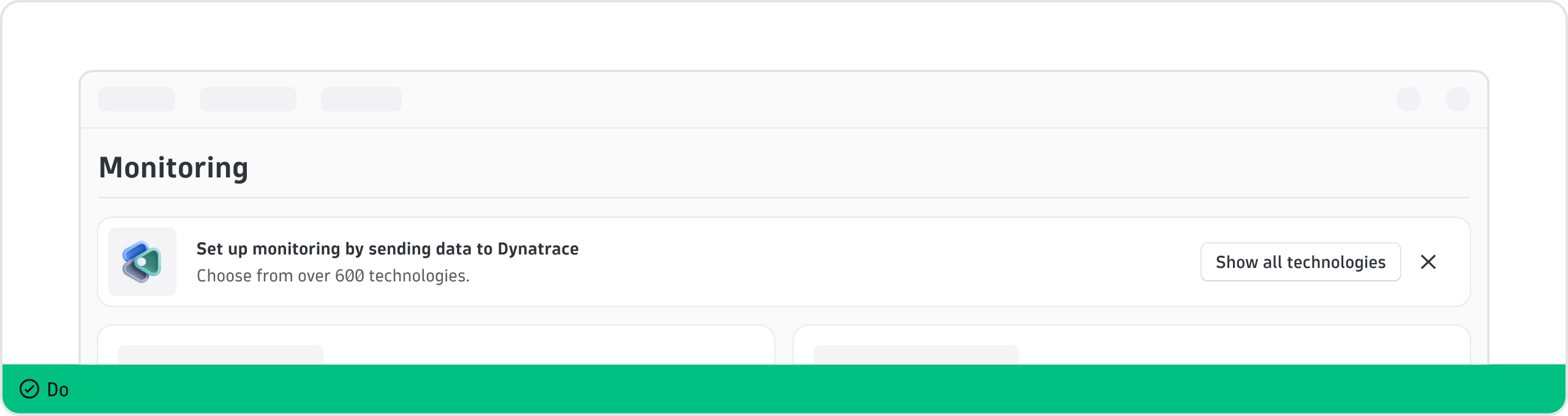
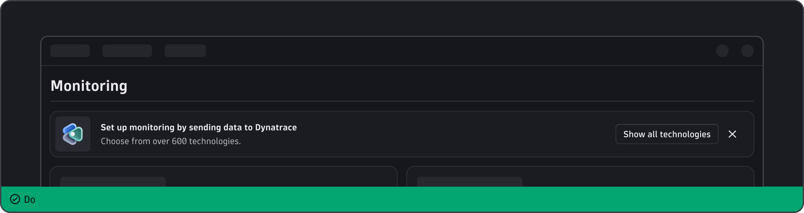
Surface can be used to create dismissible cards for guided interaction. Dismissible cards are noticeable but non-intrusive patterns for non-critical information. Users can read, return to, or act upon the information when it suits them. Dismissible cards don't demand acknowledgement and don't permanently clutter the UI.
Best practices
- Include a dismiss button—either an "X" or "Got it"—so users can dismiss the card without taking any action.
- Stick to one dismissible card per view. Don't fill an empty page with multiple dismissable cards.
- Add a relevant image, illustration, or icon to draw the user's attention.
Writing guidelines
- Use a clear, concise heading to communicate the point of the card. Don't put a period at the end of the heading.
- Keep the description to a maximum of two sentences. Eliminate unnecessary words and finish sentences with periods.
- If you include a link, follow the content guidelines for link text.
- For any buttons, including the dismiss button, follow the usage guidelines for Button.