ToggleButtonGroup
ToggleButtonGroup lets users toggle between a set of related options,
typically with one preselected. It's best for switching between views or a
compact group of options with immediate effect.
When to use
- To present related choices in a compact format where users can select one option at a time.
- To filter or control existing content on a page. For example, filtering table content by categories or use cases.
- To switch between visual representations. For example, changing from list to grid view or toggling between chart types.
- For controls that instantly update the interface without requiring additional confirmation.


When not to use
- To organize content in sections or pages and navigate between them. Instead, use Tabs.
- When there are more than five options. Use Select instead.
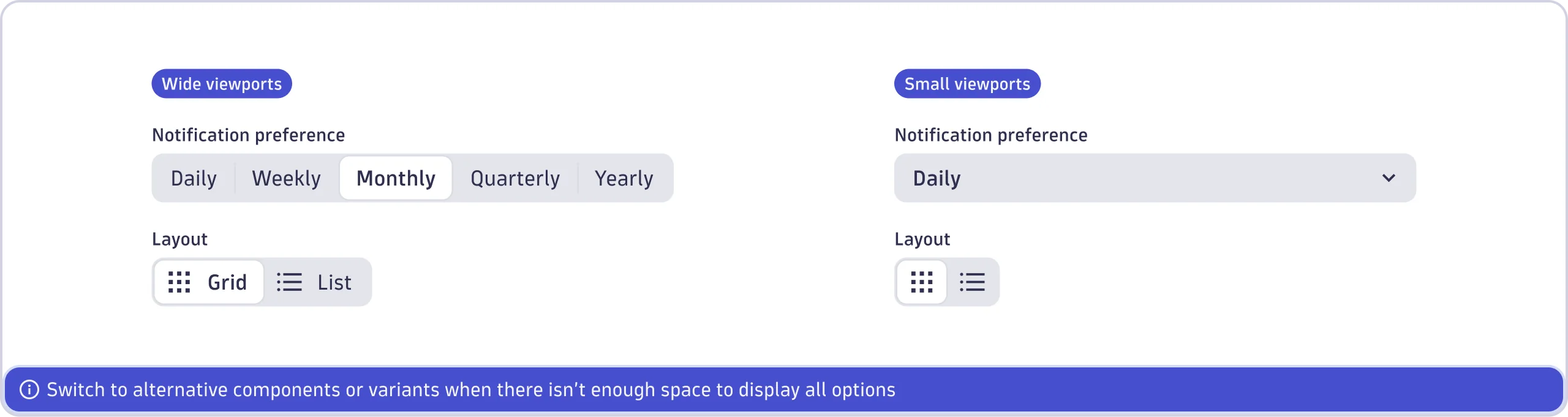
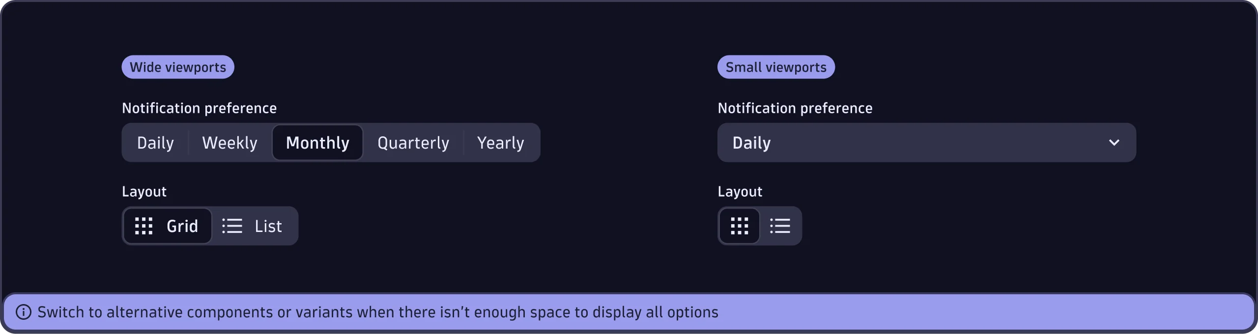
- When there isn't enough space to display all options. Use Select instead.
- For choices in forms that require additional context or a submit action. Use Radio instead.
- When users need to select multiple options. Use Select or Checkbox instead.
- For simple binary decisions, such as "yes/no" or "on/off". Use Switch instead.


Content guidelines
Labels
- Keep labels concise and under 20 characters.
- Use nouns or short phrases (e.g., "Grid view" not "Switch to grid view").
- No abbreviations.
- Use sentence case (capitalize only the first word and any proper nouns, such as brand names).
- Don't add a period.
Icons
- Don't mix text-only, icon-only, or icon-with-text options within a ToggleButtonGroup. Choose a single style.
- Only use icons without text labels (icon-only) if the icon's meaning is understood by everyone.
- Include alt-labels and tooltips to ensure clarity and accessibility for icon-only options.
- Place icons that clarify the meaning of an option before the label.

