InformationOverlay
The InformationOverlay provides additional information via an overlay, the
position of which can be adjusted. According to the type of information, the
variant can be set. The trigger consists of an icon and an optional text. By
default, the variant is neutral and the overlay is positioned on the bottom.
When to use
- To offer subtle context, guidance, or feedback, such as an information icon with additional help in an overlay, or Guided interaction.
- To clarify the purpose or functionality of a UI element.
- To link to documentation.
When not to use
- For temporary error or warning feedback. Instead, use text in the UI or a Toast.
- For information that's critical for completing a task. Use text in the UI.
- For information that's already obvious because of design, labels, or other contextual cues.
Variants
The InformationOverlay component has five variants. Each has a different
semantic meaning and can be used with or without a text label.


Neutral
- Use the neutral variant for general information that shouldn't stand out—for example, further context about a feature that may not be immediately obvious to the user.
Primary
- Use the primary variant to convey important messages and highlight crucial actions that require attention. For example, when offering essential tips, instructions, or guidance for interacting with a particular feature.
- Use the primary variant sparingly, ideally once per view or context at most.
Success
- Use the success variant to indicate the successful completion of an action or operation.
Warning
- Use the warning variant when conveying cautionary information or potential issues users may want to know about.
Critical
- Use the critical variant to indicate that the information requires immediate attention. For example, when a wrong configuration impacts a system. Always pair it with a label that complements the nature of the message. For instance, 2 clusters failing.
Content guidelines


- Trigger icon (required)
- Trigger text (optional)
- Details (required)
General guidelines
- Use sentence case (capitalize only the first word and any proper nouns, such as brand names).
- State the situation clearly in 1-2 sentences.
- End sentences with a period.
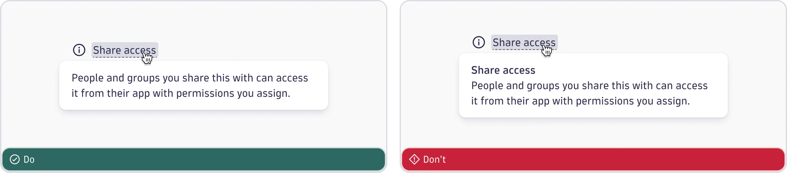
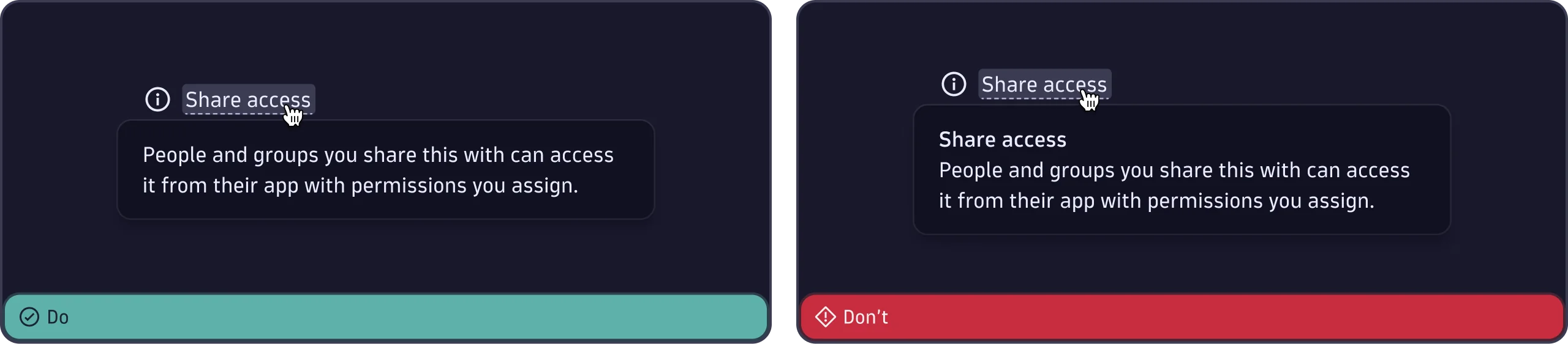
- Don't repeat the trigger text.
- Don't use all caps, exclamation marks, or alarmist words.
- Provide a descriptive text with links if additional help is available.