Accordion
Use the Accordion to progressively disclose grouped content, letting users
reveal and hide sections to reduce page length and focus on what matters.
When to use
- To progressively disclose grouped content that users don't need to see all at once.
- When users typically need to focus on one section at a time rather than view all sections simultaneously.
When not to use
- When content is brief enough that all sections can be displayed at once without overwhelming the page. Display the sections flat instead.
- When users frequently need to compare content across multiple sections simultaneously. Use tabs or flat sections instead.
Colors
Accordion comes in five colors.
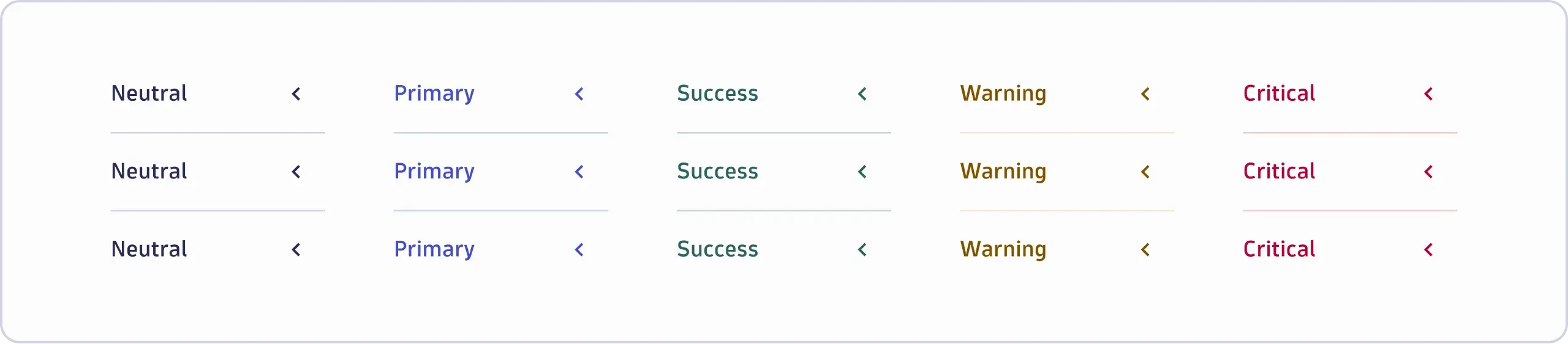
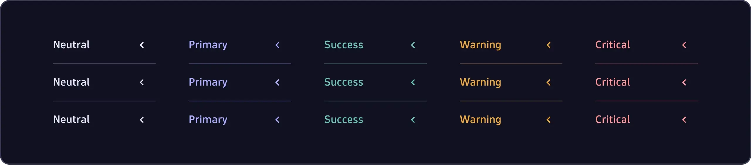
Neutral
- Use the neutral color as the default.
Primary
- Use the primary color on primary backgrounds. For example, when placing
accordions in a primary-colored
Container.
Success
- Use the success color on success backgrounds. For example, when placing
accordions in a success-colored
Container.
Warning
- Use the warning color on warning backgrounds. For example, when placing
accordions in a warning-colored
Container.
Critical
- Use the critical color on critical backgrounds. For example, when placing
accordions in a critical-colored
Container.
Tip
For more information about the semantic meaning of colors, see Status and health.
Size
Accordion comes in two sizes: default and condensed.
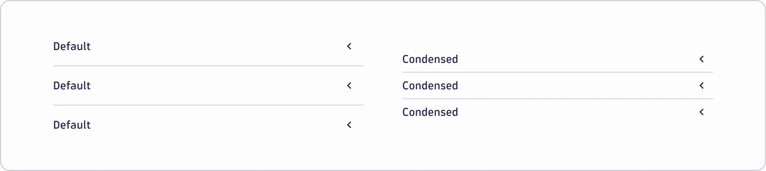

Default
- Use as the default size.
Condensed
- Use the condensed size in compact layouts or when there isn't enough space for a default-sized accordion.
Trigger position
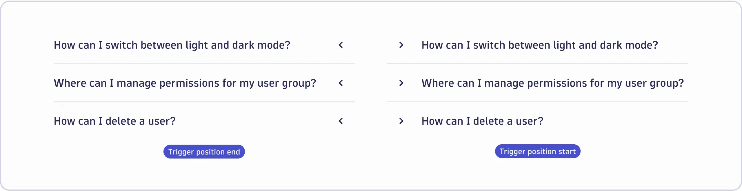
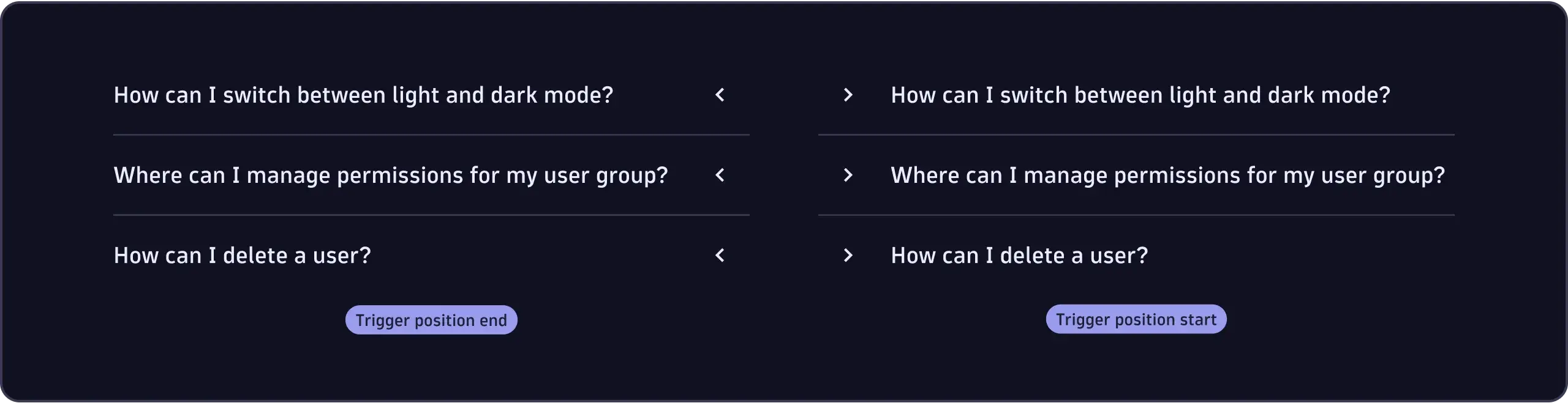
End
- Position the trigger at the end of the accordion if the collapse/expand feature is non-essential. For example, allowing users to collapse large surfaces if they don't need its content frequently.
- Position the trigger at the end of the accordion to align the label and content vertically with the surrounding elements. For example, a headline above the accordion.
Start
- Position the trigger at the start of the accordion if the collapse/expand feature is essential. For example, in an FAQ section where all items are collapsed initially.
Customizing sections
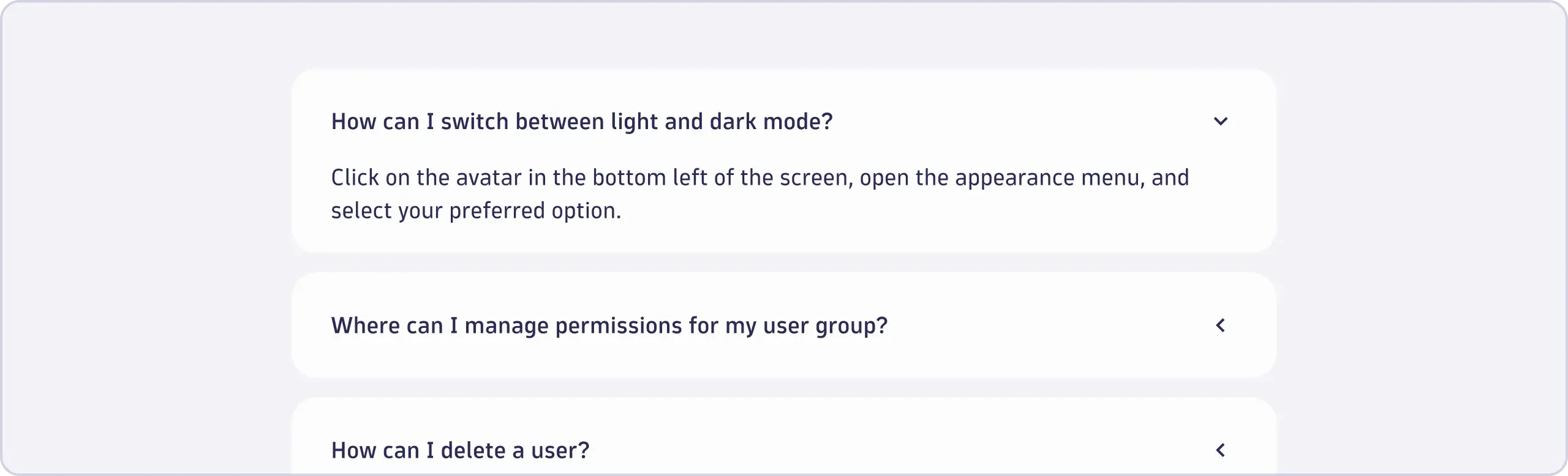

- By default, accordion sections are separated by dividers. Hide the dividers if
you're providing your own means of separation. For example, if you wrap
individual sections in a
SurfaceorContainer.
Interactivity
- By default, the entire accordion header is interactive. Clicking either the label or the trigger will collapse or expand the accordion.
- If the collapse/expand feature isn't essential or there are interactive elements inside the label, you can make only the trigger interactive.
Expanding single vs. multiple sections
Accordion supports expanding either one or multiple sections at a time.
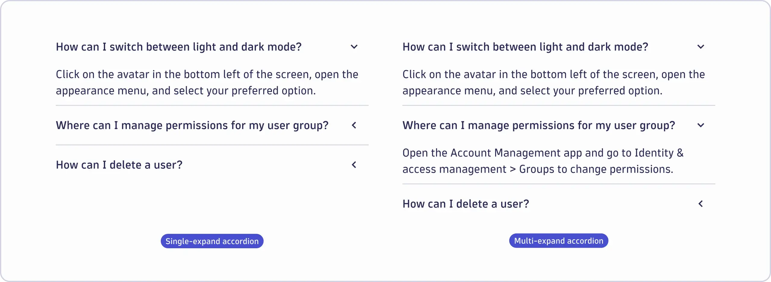
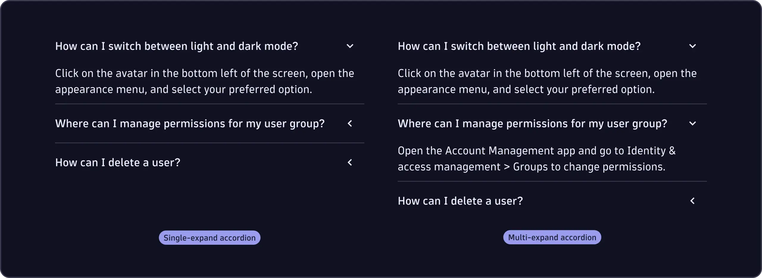
Single expand
- Use the single-expand behavior if users should focus on one section at a time.
Multi expand
- Use the multi-expand behavior if users are likely to compare information across multiple sections.