Button
Buttons let users trigger actions or events with a single click, or by pressing
Enter or Space while the button has focus.
When to use
- To trigger actions or events.
- When links need to align visually with surrounding items or when the main actions in a view are links, such as "Next" or "Previous" buttons in a guided user flow.
When not to use
- To continue a user flow in another Dynatrace app, use IntentButton instead.
- To navigate to another page within an app or view. Use Link instead.
- To navigate to an external page. Use ExternalLink instead.


Variants
Buttons come in three emphasis variants. The variants help to establish a visual hierarchy between actions.


Default
- Use for common actions that don't require special attention.
- The low visual emphasis blends seamlessly with the rest of the user interface, allowing users to focus on the main content.
- Alongside the accent variant, the default variant often triggers the opposite action. For example, a default "Cancel" button next to an accent "Confirm" button.
Emphasized
- Use for buttons that should stand out but aren't the most important actions in a view.
- Use a maximum of one emphasized button in a group of buttons.
- Don't combine emphasized and accent buttons in the same group of buttons.
Accent
- Use for the most important action in a view or the main action to move forward in a user flow.
- Don't combine accent and emphasized buttons in the same button group.
- Use sparingly, ideally once per view or context.
Colors
Buttons come in five colors, each with a unique semantic meaning.
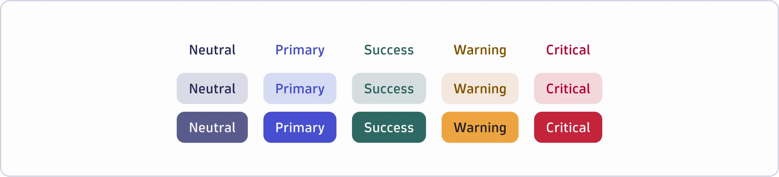

Neutral
- Use for common actions that shouldn't stand out.
- Neutral has no semantic meaning and is, therefore, the default color.
Primary
- Use for important actions that need to stand out. For example, a submit button in a form.
- Use a maximum of one primary button per view or context to support a clear visual hierarchy.
- If placing the primary button on a background (for example, in a
Container), only use the primary-colored background.
Success
- Don't use a success-colored button for positive or confirming actions such as "Submit" or "Save." Instead, use a primary-colored button.
- If placing the success button on a background (for example, in a
Container), only use the success-colored background.
Warning
- Use for actions that trigger significant changes and could be harmful. For example, a "Stop import" button in a dialog or an action that could affect the cost of Dynatrace, such as "Update query".
- Use to ensure that users pay special attention before triggering an action.
- If placing the warning button on a background (for example, in a
Container), only use the warning-colored background.
Critical
- Use for the final confirmation of a destructive action. For example, a "Delete" button in a dialog.
- If placing the critical button on a background (for example, in a
Container), only use the critical-colored background.
Sizes
Buttons come in two sizes: default and condensed.


Default
- Use in most cases. We designed it to work well with the other UI components and create a balanced look and feel.
Condensed
- Use in compact layouts or when there isn't enough space for default-sized buttons. For example, in table row actions.
Alignment on page
The alignment of a button in a view or container depends on the context.
- Align buttons left if they follow left-aligned content. For example, in a simple form or after a paragraph.
- Align buttons right to convey a sense of progression for the action triggered
by the button. For example, in a
Modal, wizard, or multi-step form. - Align buttons right in all other cases. For example, if they're part of the
AppHeaderor theTitleBar.
Order


- Order buttons according to emphasis level when multiple buttons are next to each other.
- If buttons should convey a sense of progression, order them from least
important to most important (left to right). For example, in a
Modalor "Previous" and "Next" buttons in a guided user flow. - In all other cases, order buttons from most important to least important (left to right).
- Use
Spacings.Size4for gaps between buttons. - If using a menu trigger that contains more actions, always make it the last button.
Content guidelines
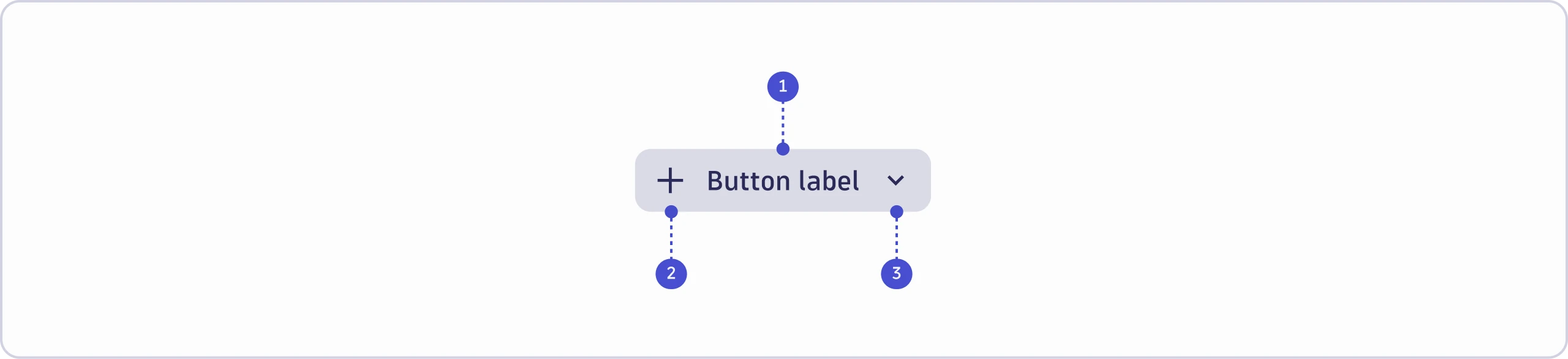

- Button label
- Prefix icon
- Suffix icon
Button label
- Use sentence case (capitalize only the first word and any proper nouns, such as brand names). In the following example, the action deletes a user's workflow:


In the next example, the action opens the Notebooks app:


- Keep it to one to three words.
- Remove unnecessary words such as "the", "a", or "an".
- Don't use punctuation (no commas, ellipses, full stops, exclamations, or question marks). This differs from inline text links such as ExternalLink or Link, which can end a sentence with a period. A button label never takes punctuation.
- Start with a verb describing the user's next action → [Verb] or [Verb] + [noun].






- Avoid vague labels, especially for warning and critical buttons.






- For restricted buttons (for example, due to missing permissions), use a tooltip to add more details.
Prefix and suffix icons
- Only use icons if they visually support the action. Don't rely solely on an icon to convey meaning.


- If the button opens another app, use IntentButton
instead. In
IntentButton, the icon of the app that will open appears before the label.

